Adding dropdowns to mat-table in Angular
Introduction
Angular Material (CDK) provides great extensibility. If you’ve built tables and wanted to enrich them with more information that should only show up after clicking on a row, this post is for you.
We’re going to add a directive that allows us to add a dropdown to any table. We’ll also take a look on how to handle closing of the dropdown and only optionally showing it.
Showing more content after clicking on one row
First, let’s take a look at our sample project. I’m using a table with some dummy data.
<table mat-table [dataSource]="dataSource">
  <ng-container matColumnDef="givenName">
    <th mat-header-cell *matHeaderCellDef>Given Name</th>
    <td mat-cell *matCellDef="let element">{{element.givenName}}</td>
  </ng-container>

  <ng-container matColumnDef="familyName">
    <th mat-header-cell *matHeaderCellDef>Family Name</th>
    <td mat-cell *matCellDef="let element">{{element.familyName}}</td>
  </ng-container>

  <tr mat-header-row *matHeaderRowDef="columnsToDisplay"></tr>
  <tr mat-row *matRowDef="let row; columns: columnsToDisplay;"></tr>
</table>
import { Component } from '@angular/core';

const DUMMY_DATA = [
  {
    givenName: 'Richard',
    familyName: 'Hendricks',
    email: 'richard@piedpiper.com',
    company: 'Pied Piper Inc.',
  },
  {
    givenName: 'Erlich',
    familyName: 'Bachmann',
    email: 'erlich@piedpiper.com',
    company: 'Pied Piper Inc.',
  },
  {
    givenName: 'Gavin',
    familyName: 'Belson',
    email: 'gavin@hooli.com',
    company: 'Hooli',
  },
];

@Component({
  selector: 'app-root',
  templateUrl: './app.component.html',
  styleUrls: ['./app.component.scss'],
})
export class AppComponent {
  dataSource = DUMMY_DATA;
  columnsToDisplay = ['givenName', 'familyName'];

  constructor() {}
}
Now, we’re adding a directive heavily inspired (but extended) by this StackBlitz. To add yours, run ng g directive directives/cdk-detail-row.
Let’s take a look at what we’re adding.
import {
  Directive,
  EmbeddedViewRef,
  HostBinding,
  HostListener,
  Input,
  TemplateRef,
  ViewContainerRef,
} from '@angular/core';

@Directive({
  selector: '[cdkDetailRow]',
})
export class CdkDetailRowDirective {
  private row: any;
  private tRef: TemplateRef<any>;
  private opened: boolean;
  private embeddedViewRef: EmbeddedViewRef<any>;

  /** if the dropdown should close when clicking outside of it */
  @Input('cdkDetailRowCollapseClickedOutside') collapseOnOutsideClick = true;
  /** if it should open the dropdown when clicked */
  @Input('cdkDetailRowEnable') enabled = true;

  @HostBinding('class.expanded')
  get expended(): boolean {
    return this.opened;
  }

  @Input()
  set cdkDetailRow(value: any) {
    if (value !== this.row) {
      this.row = value;
    }
  }

  @Input('cdkDetailRowTpl')
  set template(value: TemplateRef<any>) {
    if (value !== this.tRef) {
      this.tRef = value;
    }
  }

  constructor(public vcRef: ViewContainerRef) {}

  @HostListener('click')
  onClick() {
    if (this.enabled) {
      this.toggle();
    }
  }

  @HostListener('document:click', ['$event'])
  onClickOutside(event) {
    if (!this.collapseOnOutsideClick) return;

    if (this.checkIfClickedInside(event)) {
      return;
    } else {
      if (this.vcRef && this.opened && this.embeddedViewRef) {
        this.vcRef.clear();
        this.opened = this.vcRef.length > 0;
        this.embeddedViewRef = null;
      }
    }
  }

  // show or hide the dropdown
  toggle() {
    if (this.opened) {
      this.vcRef.clear();
    } else {
      this.render();
    }
    this.opened = this.vcRef.length > 0;
  }

  /**
   * checks if the click was inside the dropdown
   * keep in mind that it still closes when clicking on **some** elements
   */
  private checkIfClickedInside(event) {
    return (
      !event.target.className.includes('overlay-close') && // if we have a close button within our dropdown, check for this
      (!this.embeddedViewRef ||
        this.embeddedViewRef.rootNodes[0].contains(event.target) ||
        this.vcRef.element.nativeElement.contains(event.target))
    );
  }

  private render() {
    this.vcRef.clear();
    if (this.tRef && this.row) {
      // create the view from template and save the reference, as we're using check if it was clicked later
      this.embeddedViewRef = this.vcRef.createEmbeddedView(this.tRef, {
        $implicit: this.row,
      });
    }
  }
}
If we’re adding this directive to a <tr mat-row>, it will use a <ng-template> defined on our row as the detail row. Let’s add it to see it in action and change our mat-row from earlier to this:
<tr
  mat-row
  *matRowDef="let row; columns: columnsToDisplay;"
  matRipple
  class="element-row"
  [cdkDetailRow]="row"
  [cdkDetailRowTpl]="detailsTemplate"
></tr>
See how it also takes in the row so Angular knows where to put our dropdown as a child.
We also need to define what should show, so we‘ll define a template within our component. It will have all the information available that a cell also has, so you can display some rich data or of course put anything inside it.
<ng-template #detailsTemplate let-element>
  <div class="mat-row detail-row" style="overflow: hidden">
    Email: {{ element.email }}
    <br />
    Company: {{ element.company}}
  </div>
</ng-template>
It should be a dropdown!
If we take a look at it now, it still does not look good and displays after our row, so let’s make it look like a dropdown by adding some style:
@import '~@angular/material/theming';

.container {
  width: 60vw;
  margin: 0 auto;

  padding: 16px;
}

table {
  position: relative;
  width: 100%;

  .element-row:not(.inactive) {
    cursor: pointer;
  }

  .detail-row {
    padding: 16px;
    width: calc(100% - 32px);
    position: absolute;
    background: white;
    z-index: 1;
    @include mat-elevation(2);
    margin-top: -1px;
  }
}
I’ve also added a div as a wrapper for our table to make it stand out a bit more for this demo. This is our result now:
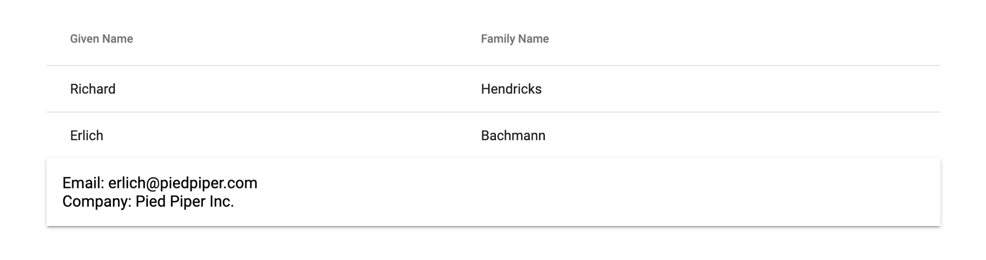
Our directive automatically gives us the auto-closing behavior when you click outside the dropdown.
Okay, but it is still lacking something, so an animation would also be a good idea. Gladly, Angular makes it really easy to add animations, so we‘re adding them to our component:
@Component({
  selector: 'app-root',
  templateUrl: './app.component.html',
  styleUrls: ['./app.component.scss']
  animations: [
    trigger('detailExpand', [
      state('void', style({ transform: 'translateY(-36px)', visibility: 'hidden', opacity: '0' })),
      state('*', style({ transform: 'translateY(0)', visibility: 'visible', opacity: '1' })),
      transition('void <=> *', animate('100ms cubic-bezier(0.4, 0.0, 0.2, 1)')),
    ]),
  ]
})
Marking our row also does not require much work, as we only need to tell Angular to use the animation we‘ve called detailExpand:
<ng-template #detailsTemplate let-element>
  <div class="mat-row detail-row" [@detailExpand] style="overflow: hidden">
    Email: {{ element.email }}
    <br />
    Company: {{ element.company}}
  </div>
</ng-template>
Not showing the dropdown
Sometimes you don’t want to show a dropdown for some of your table elements, so we‘ve also added an input to reflect that choice. If we imagine our data has a status field, we could only show the dropdown for active entries in a table:
<tr
  mat-row
  *matRowDef="let row; columns: columnsToDisplay;"
  matRipple
  class="element-row"
  [class.inactive]="row.status !== 'active'"
  [cdkDetailRow]="row"
  [cdkDetailRowTpl]="detailsTemplate"
  [cdkDetailRowEnable]="row.status === 'active'"
></tr>
Well, that’s it! Now, you can plug it in anywhere you want to and style your popup accordingly.
About accessibility
My only issue with this is of course accessibility, as it does not define everything required for full accessibility.
As I am still finding out how to make this more accessible for screen readers, I‘ll update this post in the future to reflect my findings. Generally, of course, it is not advisable to build software without making sure that every user is able to use it.